Data template fields
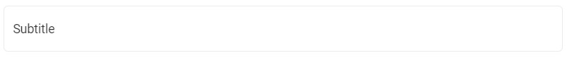
Fields are the building blocks for structured content. The type and order of the fields that you add to a content type decides how the content will eventually be presented. For instance, while creating a content type for a "Blog post", you may add fields such as "Title," "Subtitle,"' "Summary," as seen in the following screenshot:
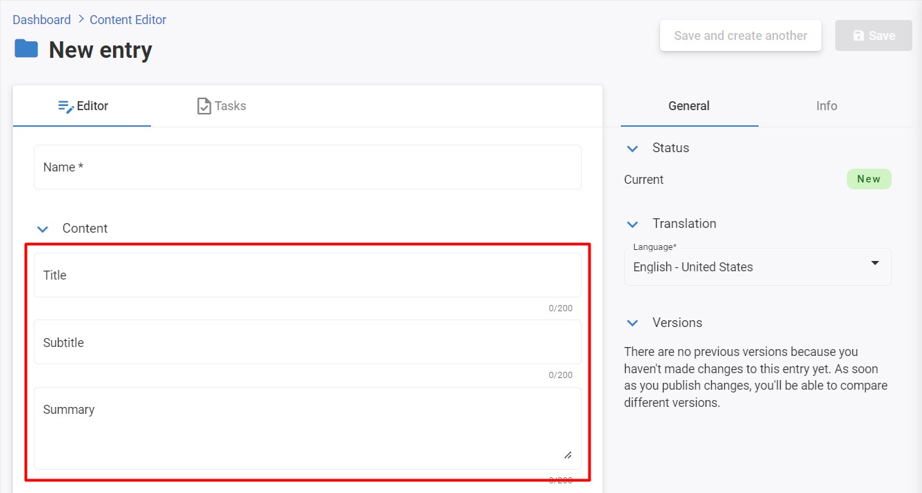
When you create an entry, all the content goes into fields. Fields are where your post's information lives!
Important
When defining code names, you must make sure that they are unique, even between field sections.
Fields are a great way to store data of various types. For example, the Number field can only accept numbers, while Single-line and Multiline Text allow for more general content input needs that may be less precise than other options such as Date or Time stamps.
Each data template consists of a set of fields that you define, these fields can be one of the following field types:
- Basic field types
- List field types
- Picker filed types
- Link field types
Basic field types
Basic field types represent an individual value.
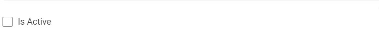
The Checkbox field type
The Checkbox field type enables users to input a "true" or "false" value in the content item.
This field will appear on your content page as shown below after being added to the data template:
The properties of this field are incredibly flexible and can be changed to suit your needs at any time.
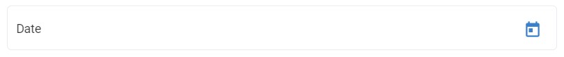
The Date field type
The Date field type enables users to input a "date" value in an entry. A user can manually choose or enter a date using the interface provided by the Date field type. The date value is stored in Coordinated Universal Time.
This field will appear on your content page as shown below after being added to the data template:
The properties of this field are incredibly flexible and can be changed to suit your needs at any time.
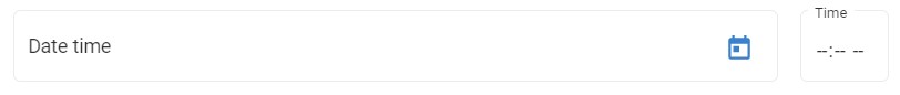
The Datetime field type
The Date Time field type enables users to input a "datetime" value in the content item. A user can manually choose or enter a date time using the interface provided by the Date Time field type. The date value is stored in Coordinated Universal Time.
This field will appear on your content page as shown below after being added to the data template:
The properties of this field are incredibly flexible and can be changed to suit your needs at any time.
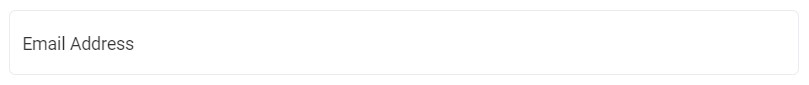
The Email Address field type
The Email Address field type input field enables users to enter an email address. This email validation is being added by default.
This field will appear on your content page as shown below after being added to the data template:
The properties of this field are incredibly flexible and can be changed to suit your needs at any time.
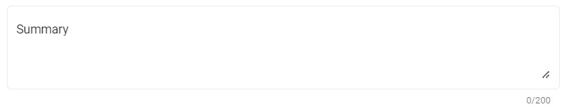
The Multiline Text field type
The Multi-Line Text field type enables users to enter simple text values spanning multiple lines.
Note
This field does not provide any formatting options.
This field will appear on your content page as shown below after being added to the data template:
The properties of this field are incredibly flexible and can be changed to suit your needs at any time.
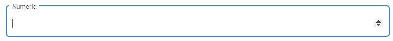
The Numeric field type
The Numeric field type input field enables users to enter numeric value in the content item.
This field will appear on your content page as shown below after being added to the data template:
The properties of this field are incredibly flexible and can be changed to suit your needs at any time.
The Rich Text field type
The Rich Text field type input field enables users to enter and store HTML text. The Rich Text Editor (RTE) field is a great way to add interactivity and visual appeal. You could use any type of content, from text and images down to videos or other types.
This field will appear on your content page as shown below after being added to the data template:
The properties of this field are incredibly flexible and can be changed to suit your needs at any time.
The Single Line Text field type
The Single Line field type input field enables users to type a single line of text.
Note
This field does not provide any formatting options and line-breaks.
This field will appear on your content page as shown below after being added to the data template:
The properties of this field are incredibly flexible and can be changed to suit your needs at any time.
The List field types
The List field field types let users select one or more items using different user interfaces. The Source property of each field specifies the options in that list, and you can create custom sources to suit your needs.
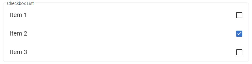
The Checkbox List field type
The Checkbox List field type enables users to select one or more check boxes specified by the Source property of the field. The checkbox field stores any selected items in a semicolon-delimited format.
This field will appear on your content page as shown below after being added to the data template:
The properties of this field are incredibly flexible and can be changed to suit your needs at any time.
The Dropdown List field type
The Dropdown List field type enables users to select a single item from the list specified by the Source property of the field. The dropdown field stores the name of the selected item.
This field will appear on your content page as shown below after being added to the data template:

The properties of this field are incredibly flexible and can be changed to suit your needs at any time.
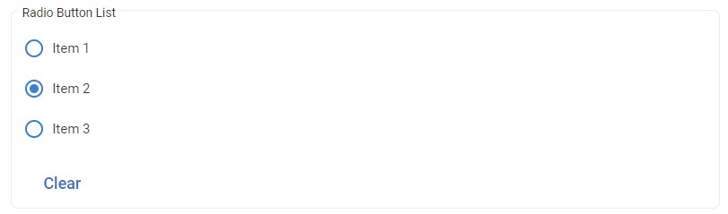
The Radio Button List field type
The Radio Button List field type enables users to select a single item from the list specified by the Source property of the field. The dropdown field stores the name of the selected item.
This field will appear on your content page as shown below after being added to the data template:
The properties of this field are incredibly flexible and can be changed to suit your needs at any time.
The Picker field types
The Picker field types let users select one or more items of content or assets using different user interfaces.
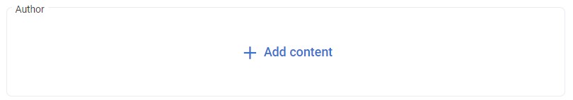
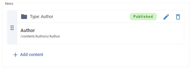
The Content Picker field type
The Content Picker field type enables users to select a content item, such as "Author," "Blog Post," etc. Users can click + Add content to open the Content Browser and select the relevant content from the content editor.
This field will appear on your content page as shown below after being added to the data template:
The properties of this field are incredibly flexible and can be changed to suit your needs at any time.
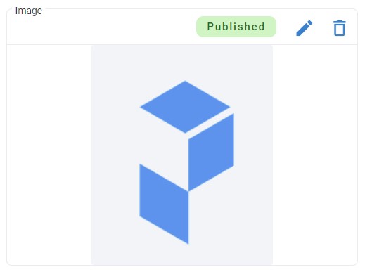
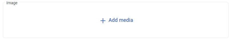
The Media Picker field type
The Media Picker field type enables users to select an asset from the Media Library. Users can click + Add media to open the Media Browser and select the relevant asset from the Media Library.
This field will appear on your content page as shown below after being added to the data template:
The properties of this field are incredibly flexible and can be changed to suit your needs at any time.
The Multiple Content Picker field type
The Multiple Content Picker field type enables users to select none or several content entries, such as "Author," "Blog Post," etc. Users can click + Add content to open the Content Browser and select the relevant content from the content editor. Content editors can add multiple entries, move them up or down, or remove them, as and when required. The multiple content picker field stores any selected entry IDs in a semicolon-delimited format.
This field will appear on your content page as shown below after being added to the data template:
The properties of this field are incredibly flexible and can be changed to suit your needs at any time.
The Multiple Media Picker field type
The Multiple Media Picker field type enables users to select none or several assets from the Media Library. Users can click + Add media to open the Media Browser and select the relevant asset from the Media Library. Content editors can add multiple assets, move assets up or down, or remove them, as and when required. The Multiple Media Picker stores any selected asset IDs in a semicolon-delimited format.
This field will appear on your content page as shown below after being added to the data template:
The properties of this field are incredibly flexible and can be changed to suit your needs at any time.
The Link field types
The Link field type enables users to enter links to content entries, external URLs and anchors.
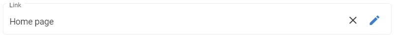
The General link field type
The General link field type enables users to link to the content item, an anchor or external URLs.
This field will appear on your content page as shown below after being added to the data template:
The General link modal: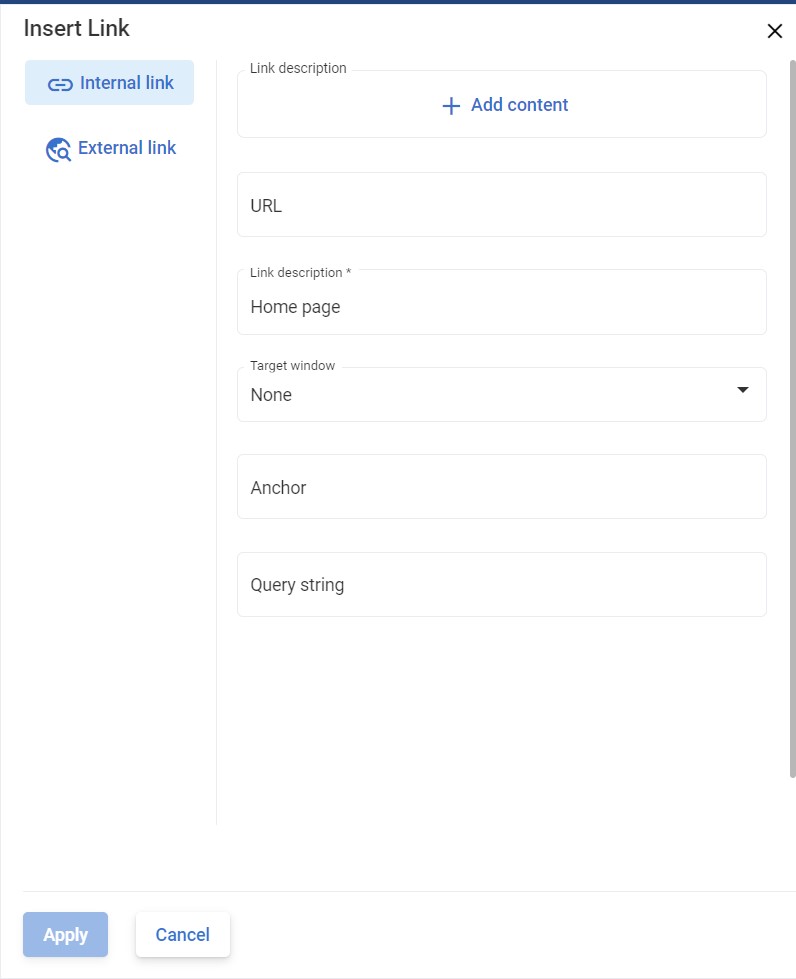
The properties of this field are incredibly flexible and can be changed to suit your needs at any time.
Field properties
Properties define the nature and behavior of a field. By setting various field attributes, these properties enable you to specify a field's nature. This allows you to design a dynamic and adaptable structure for your data template.
Name
It is used as the label for the field.
Code Name
The Code Name property represents a unique string that is associated with a field.
Note
The Code Name must be unique. A validation error happens when a data template is saved if multiple fields with the same code name are defined on the same data template. However, fields can also be inherited from base templates, and a data template can have multiple fields with the same code name.
Warning
If you change the Code Name of this field, it will have an immediate impact on any applications currently using that one. Make sure to update those apps as well!
Help Description
The Help Description property allows you to add context-sensitive help text that assists content editors.
Max Length
You can limit the maximum number of characters a user can enter in a field using the Max Length property.
The limit lets you specify how many characters a user can enter into any given field in order to restrict what's being entered and also protect against endless strings that might cause your website/system not to work properly since there would be no end in sight!
Default Value
The field's default value will be shown whenever a new entry is created. It means that if you want to provide users with instructions or reminders about what they should enter in some particular entry, it can be quickly done by adjusting the default value.
The benefit of using this property is when you want to create multiple entries but don't want to enter the same data repeatedly.
Start Node
The Start Node property indicates the start folder displayed in the content or media library dialog box. The root node will be used if the Start Node is not set.